What Price History Tools Actually Track
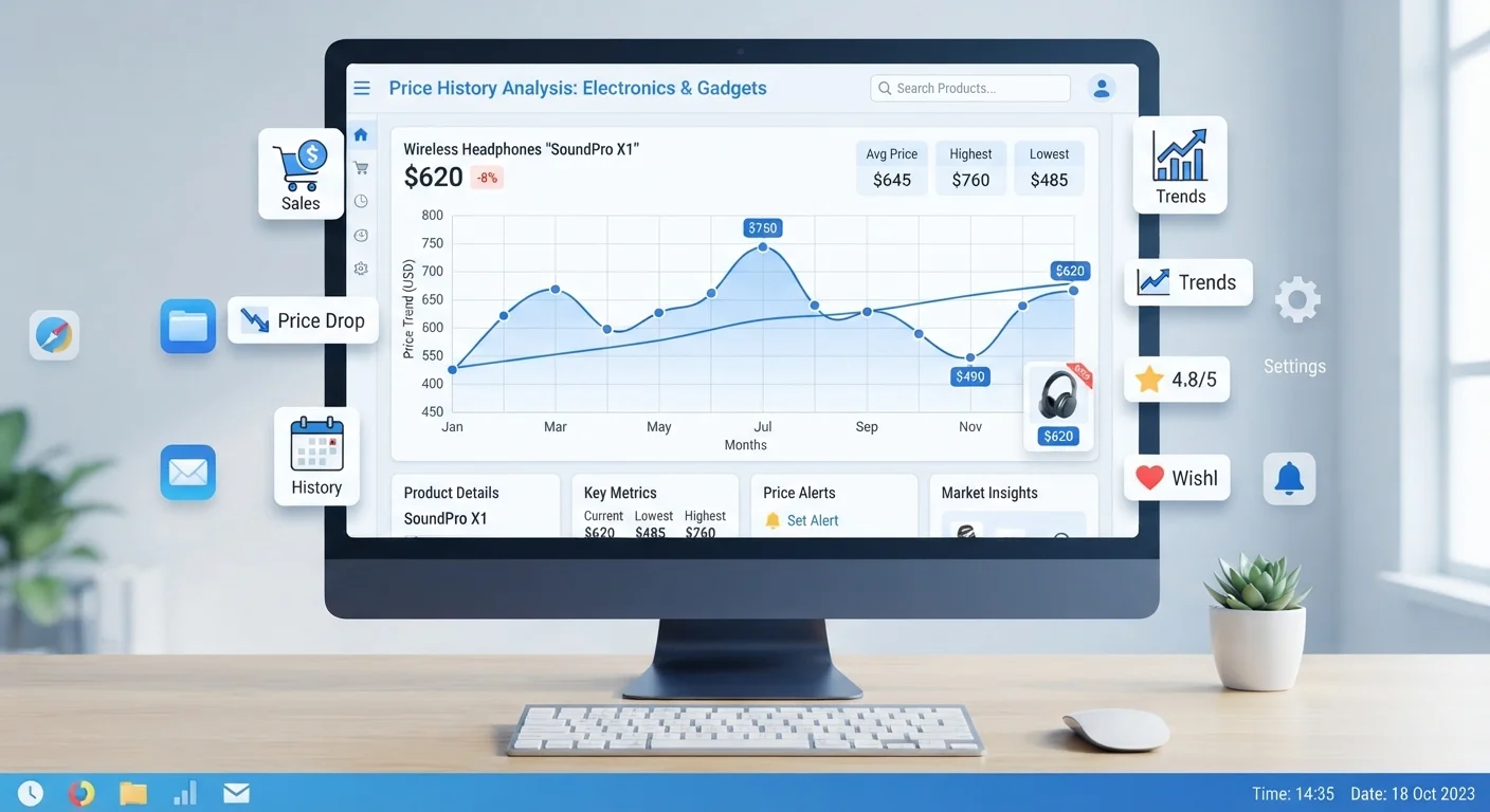
Price history tools are browser extensions or web-based services that log the listed price of a product at regular intervals - sometimes daily - and display that data as a line chart. Most tools focused on major retail platforms pull price data each time a product page is crawled, recording the date and the price shown to shoppers at that moment.
What they capture includes:
- The listed retail price - the figure shown on the product page before any promotions are applied.
- Sale or promotional prices - temporary reductions the retailer applies, which appear as dips on the chart.
- Price spikes - sharp increases that sometimes occur before a major sale event, making the subsequent "discount" look larger than it actually is.
What most tools do not track: final checkout prices after stacked coupons, third-party seller prices (unless specifically selected), or pricing shown only to account holders. For a fuller picture of what you'll actually pay, pair this data with the full cost breakdown covering shipping, compatibility, and other overlooked fees.
Browser Extensions Make This Automatic
Several browser extensions overlay price history charts directly onto product pages as you browse, so you never need to open a separate tool. Look for extensions that support the specific retailers you shop most frequently. Enable them before a sale event begins so the historical data is already loaded when you need it.
How to Read a Price History Chart
Once you pull up a price history chart, focus on four elements rather than just the current price marker.
Identify the price floor (baseline)
Scan the lowest sustained price on the chart - not a one-day anomaly, but a level the price has held at for at least a week or two. This is the practical floor and the benchmark against which everything else is measured.
Note recent price spikes before sale events
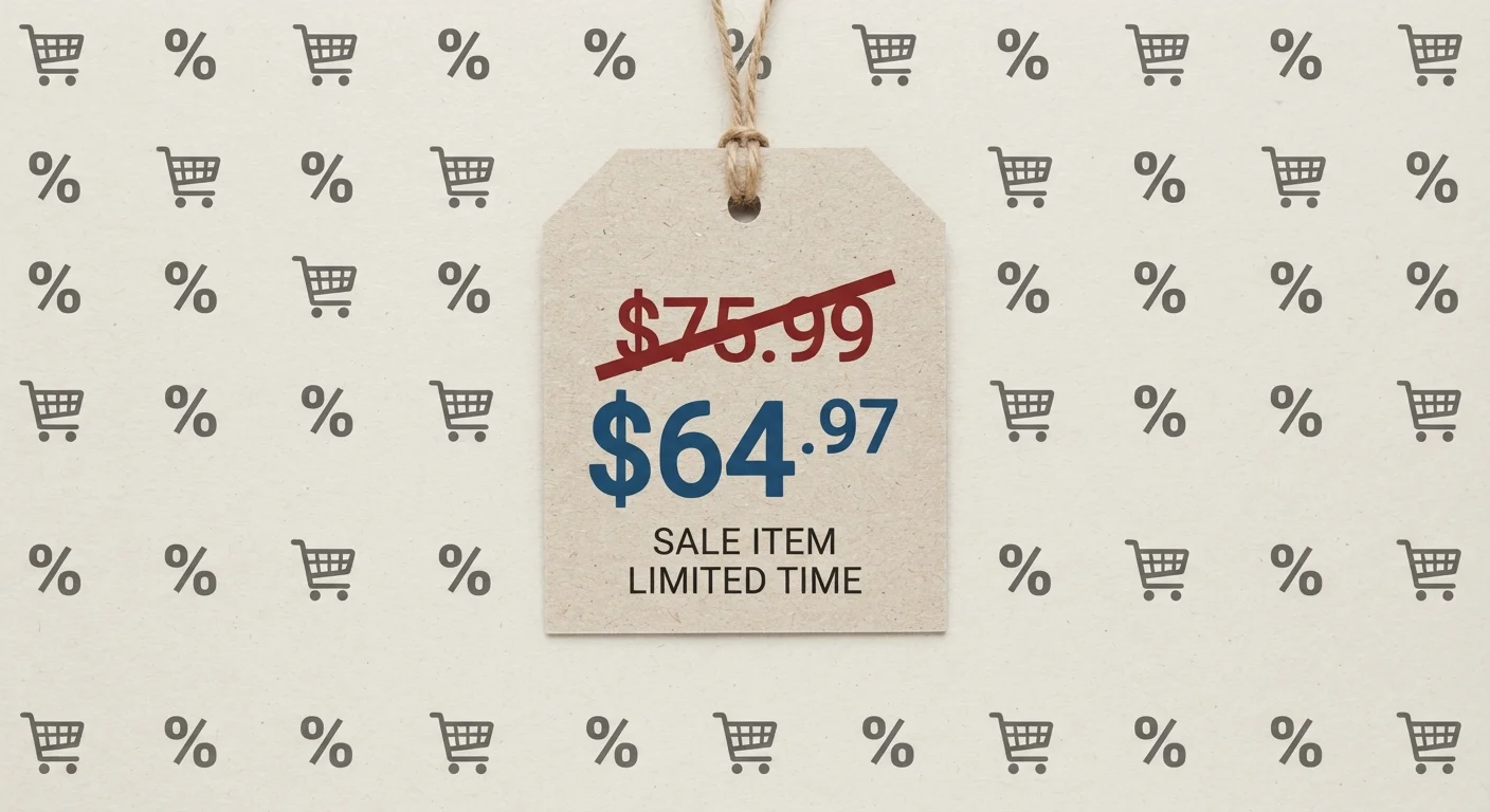
Look at the 30-60 days immediately before any current promotion. A common tactic - sometimes called a "pre-sale markup" - involves raising the listed price before a sale so the percentage discount appears larger. If the chart shows a sharp rise just before the sale date, the "original price" being crossed out may be artificial.
Calculate where the current price sits relative to the average
Many tools display an average price alongside the chart. If the current price is at or below that average, it is at least a normal price. If it is meaningfully below - and the chart shows this level has been rare - that is a stronger signal of a genuine reduction. If it is above average, you are paying more than typical regardless of any "sale" label.
Check the trend direction over the past two to four weeks
A price that has been falling steadily suggests further drops may be coming - waiting could be worthwhile if the product is not urgently needed. A price that has been flat near its floor for several weeks is less likely to drop further soon. A price that recently jumped and is being advertised as "on sale" warrants extra scrutiny against the baseline you identified in Step 1.
Cross-reference the chart against the current deal framing
Return to the product page and compare what the retailer is claiming - the percentage off, the "was" price, the urgency messaging - against what the chart actually shows. If the claims align with the historical data, the deal may be genuine. If they conflict, the chart gives you the objective record. For a broader look at the signals that separate real price drops from marketing framing, see the anatomy of a genuine online deal.
Understanding these elements together gives you a working picture of whether the current price is genuinely low or simply average. For additional context on how retailers construct perceived discounts, see how reference pricing and drip pricing work.
Charts Only Reflect Listed Prices
Price history tools record the price shown on the product page - not what different shoppers may actually pay. Personalized pricing, loyalty discounts, and account-holder promotions may not appear in the data. Treat the chart as a strong baseline reference, not an exhaustive record of every price that has ever been offered.
Putting the Data to Work
A chart only becomes useful when you apply it to a decision. If the current price sits at or below the product's historical average and has been stable for several weeks, you have reasonable evidence it is not inflated. If the price spiked in the two weeks before a major sale event and the "sale" price merely returns it to where it was before, the data reveals that pattern plainly.
Combine price history with seasonal price cycle knowledge - certain categories follow predictable annual patterns, and a chart showing a product always drops in a specific month gives you a concrete waiting target. You can also set price-drop alerts within many tools, so you receive a notification when a product hits a threshold you define rather than checking manually.
For a structured framework that brings together history data, discount signals, and savings stacking, the complete guide to identifying real online discounts is a useful next step. And if keeping purchase decisions within a broader spending plan matters to you, the budgeting basics hub offers straightforward frameworks for tracking everyday spending.