Why Pattern Mistakes Happen - and Why They're Fixable
Patterns and prints are some of the most exciting tools in everyday dressing - and some of the most misunderstood. Unlike solid colors, prints carry built-in complexity: scale, color, spacing, and placement all interact at once. That's a lot of variables, which explains why even experienced dressers occasionally step out in a combination that felt great at home but reads as chaotic in daylight.
The good news? Most pattern mistakes follow predictable patterns of their own. Once you know what's actually going wrong, fixing it is straightforward - no expensive wardrobe overhaul required. This is also about expanding your options, not restricting them. Knowing the fundamentals means you can break any guideline deliberately and pull it off.
Avoid Letting 'Rules' Override Your Instincts
Styling guidance is meant to expand your options, not restrict them. If a combination feels right to you and you wear it with confidence, that matters far more than following any checklist. Use these tips as a starting point, not a rigid rulebook.
The Most Common Pattern Styling Mistakes
These are the missteps that come up most often - with practical ways to course-correct each one.
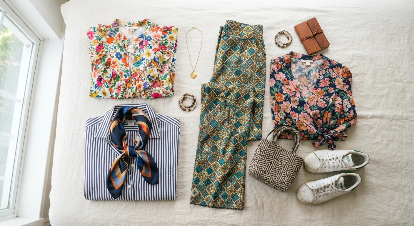
Mixing prints of the same scale, causing visual competition between the two patterns.
Why it happens: When people first try mixing prints, they reach for pieces they individually love - but similar-sized patterns clash because neither reads as dominant.
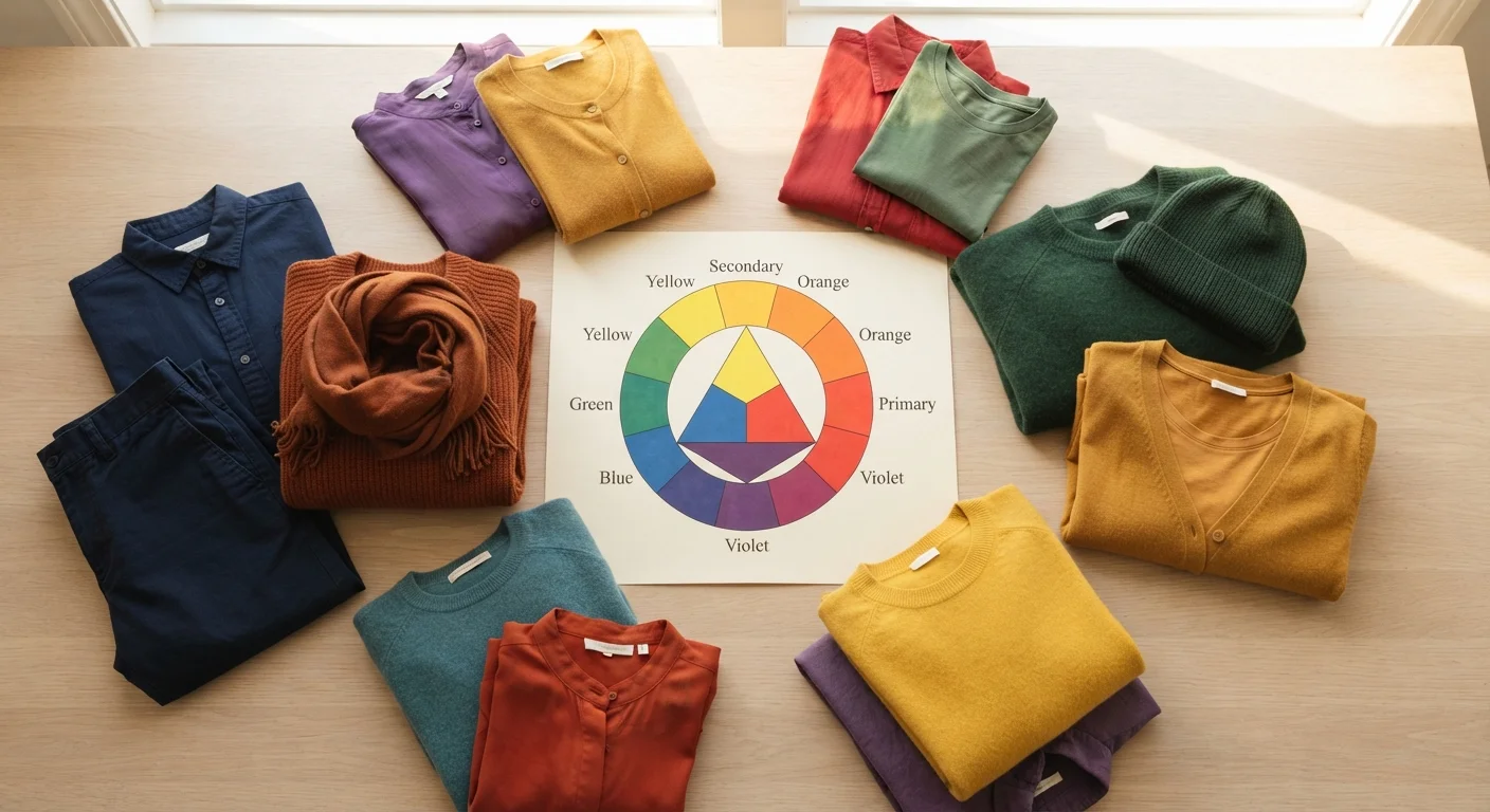
Choosing prints in completely unrelated color families, making an outfit feel disconnected.
Why it happens: Shoppers often focus on pattern shape rather than color when mixing prints, overlooking how much color unifies an outfit.
Going head-to-toe in loud, large-scale print without any visual rest point.
Why it happens: Maximalist looks appear effortless on runways, so it seems logical to just commit fully - but runway styling is built around specific lighting and styling support most people don't have.
Ignoring fit when choosing patterned pieces, which amplifies any fit issue.
Why it happens: Fit problems are easier to overlook in solid colors. Stripes, grids, and geometric prints make pulling, bunching, or off-grain alignment immediately visible.
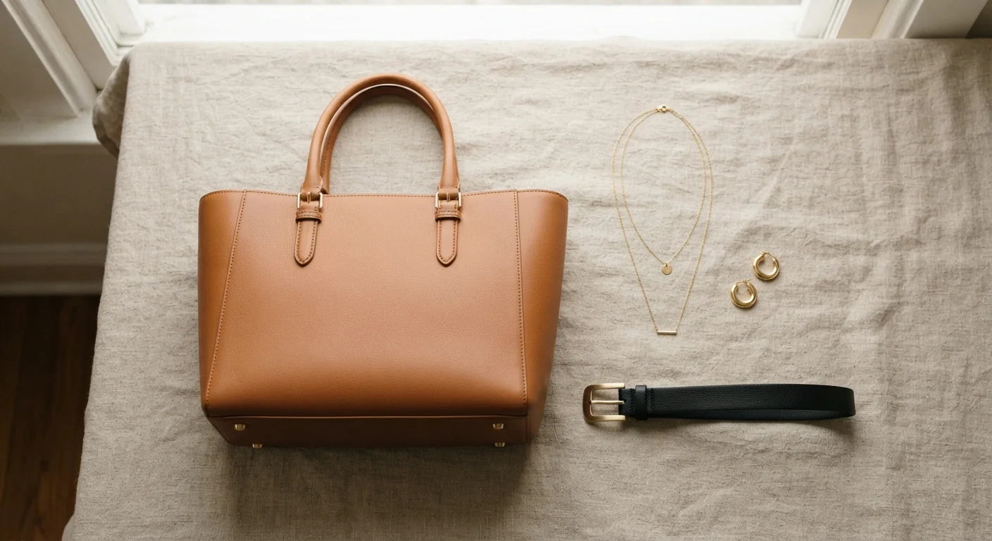
Adding heavily patterned accessories to an already busy printed outfit, creating visual overload.
Why it happens: Accessories are often chosen after an outfit is built without accounting for the pattern already present in clothing.
Assuming certain prints are off-limits for their body type and never experimenting.
Why it happens: Old-school 'rules' about horizontal stripes or large prints discouraged many people from trying them at all.
One underrated habit worth building: rewearing your best pattern combinations rather than constantly experimenting. Once you land on a mixed-print pairing that works, it's worth noting and repeating intentionally.
Pattern Placement Affects Perception
Where a print sits on the body draws the eye - this is a neutral fact, not a judgment. Understanding it gives you creative control rather than anxiety. Use placement intentionally to highlight what you love about your look, not to hide or 'fix' anything. Style is personal, and there is no universally 'correct' way to wear a print.
Putting It All Together
Successful pattern mixing comes down to three anchors: scale contrast, color connection, and visual rest. If your outfit has those three things, it almost always reads as intentional. If it's missing one, that's usually what feels off - and that's the fix to make.
~60%
Shoppers who find mixing prints intimidating
Consumer surveys on fashion confidence consistently show that pattern mixing ranks among the styling tasks people feel least equipped to attempt.
3:1
Recommended solid-to-pattern ratio for beginners
Many style educators suggest anchoring one patterned piece with two to three solid or neutral items when building outfit confidence with prints.
Keep in mind that fit is the foundation everything else builds on. Understanding how sizing varies across brands can help you find patterned pieces that actually work on your body from the start, saving you the frustration of a great print that simply doesn't sit right.
Prints are meant to be fun. Use these principles as a toolkit, and then trust your eye - it gets sharper every time you experiment.